
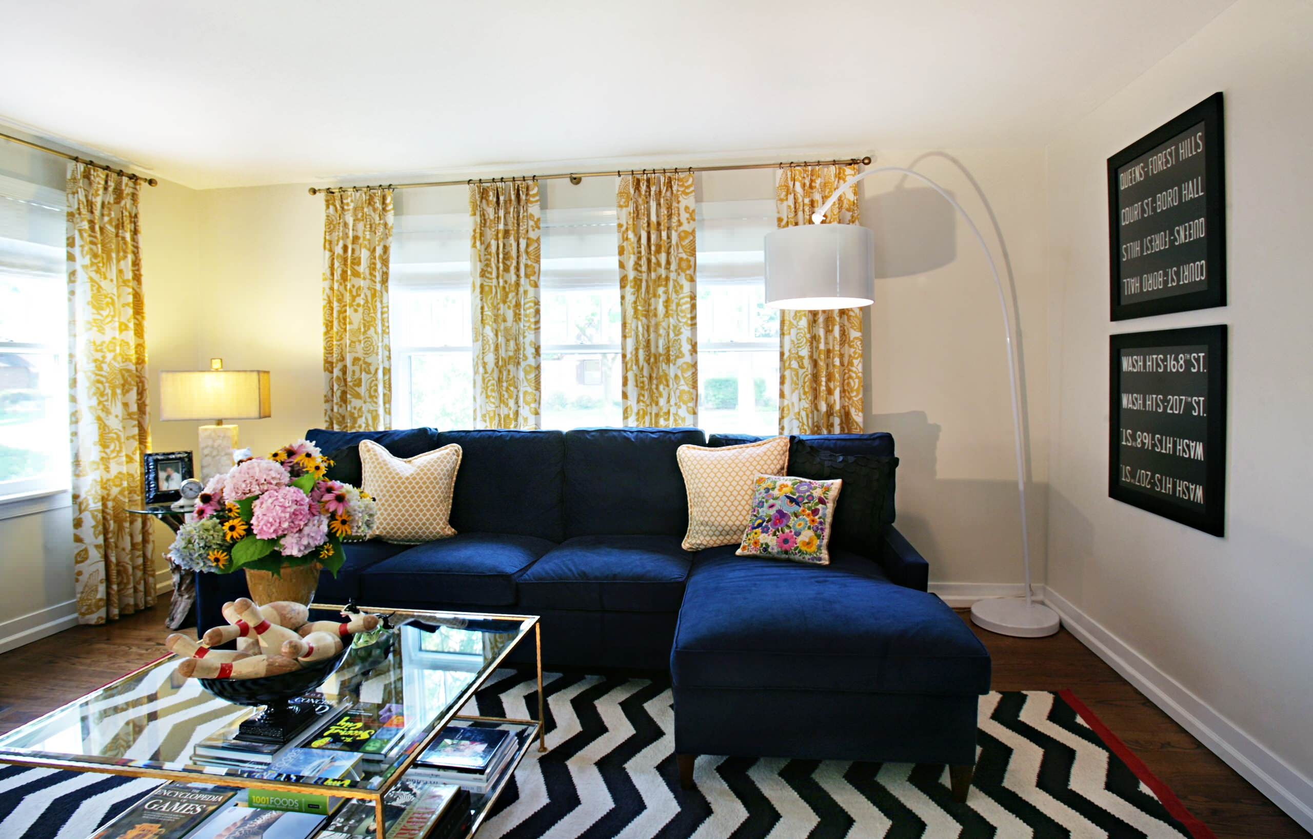
Dark-colored furniture often gives an impression of “stability” and “high quality.” However, many people worry when placing it in a small space—will it make the room feel too cramped? Will it make the room appear even smaller?
Actually, the answer isn’t one-size-fits-all. Dark-colored furniture isn’t a “no-go zone” for small spaces. As long as you master the correct color proportions and lighting techniques , it can actually make your home appear more layered and stylish.
This “Dark Furniture Matching Guide” will help you master the key to visual balance, improve your home style aesthetics , and make small apartments feel spacious and not dull.
1. Why do dark-colored furniture tend to make a space appear smaller?
To understand this issue, let’s start with the principles of vision.
Dark-colored furniture (such as dark walnut wood, black metal, and dark gray fabric) has a “light-absorbing” property—it draws the eye to the surface of the object, shrinks the boundaries of the space, and makes it seem as if “the walls are closer.”
If the walls, floors, and curtains are all dark-colored, and there is insufficient light, a small space can easily feel like a cave: oppressive, dark, and lacking a sense of breathing.
Designers often say, “Dark colors are not the problem; proportion and balance are the key .”
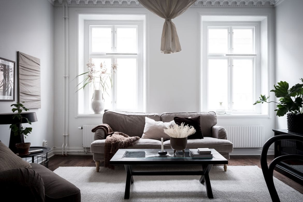
II. Color Balance Techniques: The Golden Ratio of Primary, Secondary, and Accent Colors
In home color matching, a practical rule is the “three-color layering method”:
Main color (approximately 60%) : Large areas such as walls and floors.
Secondary colors (approximately 30%) : Soft furnishings such as curtains, carpets, and bedding.
Accent colors (approximately 10%) : details such as cushions, decorative paintings, and lighting fixtures.
If your furniture is dark-colored, it’s best to keep the walls and floors in lighter colors so that the dark furniture becomes the visual focus instead of making the space feel like a “black hole”.
For example:
Off-white walls + light wood floors + dark brown furniture
It looks like a “contrast with breath”—clear distinction between light and dark, yet not oppressive.
This “light background highlighting dark furniture” approach is also a mainstream combination in many current interior design cases.
III. The Triple Benefits of Dark Furniture + Light Background
1️⃣ Creates visual focus without making it overly heavy.
Dark furniture can stabilize the atmosphere of a space, while a light background provides visual “breathing.” For example:
Dark gray sofa + light beige rug
The furniture appears more three-dimensional, and the space feels lighter.
2️⃣ Enhances light reflection and improves brightness
Light-colored walls or floors reflect natural light, making a space appear more open and airy. Even if the furniture is walnut-colored, it won’t feel dark.
3️⃣ Maintain texture while avoiding pressure
Dark colors inherently possess a sense of sophistication, but they require “balance.” Light-colored backgrounds, soft lighting, and mirror-like reflections are their best partners.

IV. Four practical tips for using dark-colored furniture in small spaces
1. Control the proportion: Dark-colored furniture should not be used to cover the entire surface.
In small apartments, avoid letting dark-colored furniture dominate the visual space.
Recommendation:
Choose one piece of dark-colored furniture for the main piece (such as a sofa or bed frame);
Use light colors to balance out other furniture or walls.
2. Brighten the space with bright furnishings and reflective decorations.
Placing light-colored vases, shiny metal lamps, or hanging mirrors next to dark cabinets are all “pressure-breaking techniques.”
They can reflect light and break the visual monotony.
3. Treat the walls, floors, and soft furnishings as a whole for coordination.
Walls: Neutral colors such as white, beige, and light gray are recommended.
Flooring: Dark wood flooring pairs well with light-colored furniture; light wood flooring pairs well with dark-colored furniture.
Soft furnishings: Maintain medium brightness and allow for natural transitions between layers.
4. Enhance lighting design
Dark-colored furniture absorbs light, so it needs to be supplemented with light:
Choose semi-sheer, light-colored curtains; avoid blocking natural light.
Layered lighting (main light + floor lamp + table lamp) can be used to illuminate different areas.
Mirrors and metallic finishes can reflect light, making a space feel more open and airy.
V. Practical Color Scheme Reference
�� Living Room
Main color scheme: off-white walls + light gray carpet (60%)
Secondary color scheme: Light wood coffee table + beige curtains (30%)
Accent colors: Dark brown sofa + dark green cushions + gold lamps (10%)
�� Restaurant
Main color scheme: white walls + gray cabinets
Secondary colors: light-colored wooden tables and chairs
Accent colors: Dark wood sideboard + black pendant light
�� Bedroom
Main color scheme: light beige walls + light wood flooring
Secondary colors: light gray bed sheets + beige curtains
Accent colors: Dark-colored bedside table + black-framed picture + geometric patterned rug
Tip: Placing a large mirror or a reflective object near the window at the foot of the bed instantly doubles the feeling of space.
VI. Common Misconceptions and How to Avoid Them
Myth 1: Dark + Dark = Sophistication
→ In small spaces, this will only make the space feel more cramped. The correct approach is to use contrast between light and dark shades.
Myth 2: Using only light colors will make a space appear larger
→ Without the contrast of dark colors, a space can easily appear “flat” and lack depth.
Myth 3: Furniture that is too large or placed too densely
→ Even the best color scheme cannot overcome an overcrowded space. Maintain passageways and white space to allow the space to breathe.
VII. Conclusion: Making Dark-Colored Furniture “Calm but Not Heavy”
Dark-colored furniture is not the enemy of small spaces, but rather an amplifier of temperament and style .
The key is balance.
Using a light-colored background to highlight dark furniture emphasizes depth and visual balance.
A 60-30-10 ratio is used to control the primary and secondary colors
, enhancing light and reflection to avoid overwhelming
the space. Reserving negative space allows the eyes to breathe.
By mastering these color balancing techniques, even small spaces can still achieve a calm, elegant, bright, and airy atmosphere using dark-colored furniture.